# 语义
# 表单
当创建一个表单,你可能使用到以下几个元素:<form>、<label>、<input>、<textarea> 和 <button>。
标签通常放置在表单字段的顶部或左侧:
<form action="/dataCollectionLocation" method="post" autocomplete="on">
  <div v-for="item in formItems" :key="item.id" class="form-item">
    <label :for="item.id">{{ item.label }}: </label>
    <input
      :type="item.type"
      :id="item.id"
      :name="item.id"
      v-model="item.value"
    />
  </div>
  <button type="submit">Submit</button>
</form>
2
3
4
5
6
7
8
9
10
11
12
See the Pen Simple Form by Maria (@mlama007) on CodePen.
注意如何在表单元素中包含 autocomplete='on',它将应用于表单中的所有输入。你也可以为每个输入设置不同的自动完成属性的值 (opens new window)。
# 标签
提供标签以描述所有表单控件的用途;链接 for 和 id:
<label for="name">Name</label>
<input type="text" name="name" id="name" v-model="name" />
2
See the Pen Form Label by Maria (@mlama007) on CodePen.
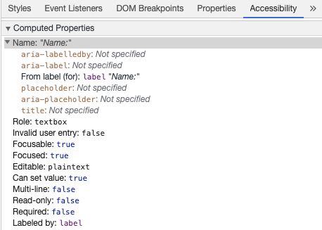
如果你在 chrome 开发工具中检查这个元素,并打开 Elements 选项卡中的 Accessibility 选项卡,你将看到输入是如何从标签中获取其名称的:
警告:
虽然你可能已经看到这样包装输入字段的标签:
<label>
  Name:
  <input type="text" name="name" id="name" v-model="name" />
</label>
2
3
4
辅助技术更好地支持用匹配的 id 显式设置标签。
# aria-label
你也可以给输入一个带有aria-label (opens new window) 的可访问名称。
<label for="name">Name</label>
<input
  type="text"
  name="name"
  id="name"
  v-model="name"
  :aria-label="nameLabel"
/>
2
3
4
5
6
7
8
See the Pen Form ARIA label by Maria (@mlama007) on CodePen.
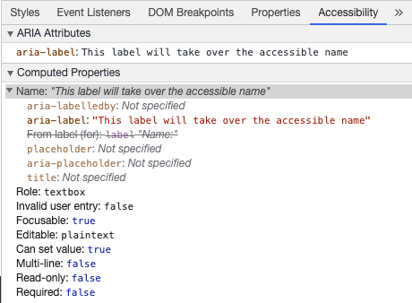
请随意在 Chrome DevTools 中检查此元素,以查看可访问名称是如何更改的:
# aria-labelledby
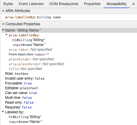
使用 aria-labelledby (opens new window) 类似于 aria-label,除非标签文本在屏幕上可见。它通过 id 与其他元素配对,你可以链接多个 id:
<form
  class="demo"
  action="/dataCollectionLocation"
  method="post"
  autocomplete="on"
>
  <h1 id="billing">Billing</h1>
  <div class="form-item">
    <label for="name">Name:</label>
    <input
      type="text"
      name="name"
      id="name"
      v-model="name"
      aria-labelledby="billing name"
    />
  </div>
  <button type="submit">Submit</button>
</form>
2
3
4
5
6
7
8
9
10
11
12
13
14
15
16
17
18
19
See the Pen Form ARIA labelledby by Maria (@mlama007) on CodePen.
# aria-describedby
aria-describedby (opens new window) 的用法与 aria-labelledby 相同,预期提供了用户可能需要的附加信息的描述。这可用于描述任何输入的标准:
<form
  class="demo"
  action="/dataCollectionLocation"
  method="post"
  autocomplete="on"
>
  <h1 id="billing">Billing</h1>
  <div class="form-item">
    <label for="name">Full Name:</label>
    <input
      type="text"
      name="name"
      id="name"
      v-model="name"
      aria-labelledby="billing name"
      aria-describedby="nameDescription"
    />
    <p id="nameDescription">Please provide first and last name.</p>
  </div>
  <button type="submit">Submit</button>
</form>
2
3
4
5
6
7
8
9
10
11
12
13
14
15
16
17
18
19
20
21
See the Pen Form ARIA describedby by Maria (@mlama007) on CodePen.
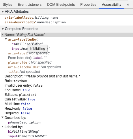
你可以通过使用 Chrome 开发工具来查看说明:
# 占位符
避免使用占位符,因为它们可能会混淆许多用户。
占位符的一个问题是默认情况下它们不符合颜色对比标准 (opens new window);修复颜色对比度会使占位符看起来像输入字段中预填充的数据。查看以下示例,可以看到满足颜色对比度条件的姓氏占位符看起来像预填充的数据:
See the Pen Form Placeholder by Maria (@mlama007) on CodePen.
最好提供用户在任何输入之外填写表单所需的所有信息。
# 操作指南
为输入字段添加说明时,请确保将其正确链接到输入。你可以提供附加指令并在 aria-labelledby (opens new window) 内绑定多个 id。这使得设计更加灵活。
<fieldset>
  <legend>Using aria-labelledby</legend>
  <label id="date-label" for="date">Current Date:</label>
  <input
    type="date"
    name="date"
    id="date"
    aria-labelledby="date-label date-instructions"
  />
  <p id="date-instructions">MM/DD/YYYY</p>
</fieldset>
2
3
4
5
6
7
8
9
10
11
或者,你可以用 aria-describedby (opens new window)将指令附加到输入。
<fieldset>
  <legend>Using aria-describedby</legend>
  <label id="dob" for="dob">Date of Birth:</label>
  <input type="date" name="dob" id="dob" aria-describedby="dob-instructions" />
  <p id="dob-instructions">MM/DD/YYYY</p>
</fieldset>
2
3
4
5
6
See the Pen Form Instructions by Maria (@mlama007) on CodePen.
# 隐藏内容
通常不建议直观地隐藏标签,即使输入具有可访问的名称。但是,如果输入的功能可以与周围的内容一起理解,那么我们可以隐藏视觉标签。
让我们看看这个搜索字段:
<form role="search">
  <label for="search" class="hidden-visually">Search: </label>
  <input type="text" name="search" id="search" v-model="search" />
  <button type="submit">Search</button>
</form>
2
3
4
5
我们可以这样做,因为搜索按钮将帮助可视化用户识别输入字段的用途。
我们可以使用 CSS 直观地隐藏元素,但可以将它们用于辅助技术:
.hidden-visually {
  position: absolute;
  overflow: hidden;
  white-space: nowrap;
  margin: 0;
  padding: 0;
  height: 1px;
  width: 1px;
  clip: rect(0 0 0 0);
  clip-path: inset(100%);
}
2
3
4
5
6
7
8
9
10
11
See the Pen Form Search by Maria (@mlama007) on CodePen.
# aria-hidden="true"
添加 aria hidden="true" 将隐藏辅助技术中的元素,但使其在视觉上对其他用户可用。不要把它用在可聚焦的元素上,纯粹用于装饰性的、复制的或屏幕外的内容上。
<p>This is not hidden from screen readers.</p>
<p aria-hidden="true">This is hidden from screen readers.</p>
2
# 按钮
在表单中使用按钮时,必须设置类型以防止提交表单。
也可以使用输入创建按钮:
<form action="/dataCollectionLocation" method="post" autocomplete="on">
  <!-- Buttons -->
  <button type="button">Cancel</button>
  <button type="submit">Submit</button>

  <!-- Input buttons -->
  <input type="button" value="Cancel" />
  <input type="submit" value="Submit" />
</form>
2
3
4
5
6
7
8
9
See the Pen Form Buttons by Maria (@mlama007) on CodePen.
# 功能图像
你可以使用此技术创建功能图像。
Input 字段
- 这些图像将作为表单上的提交类型按钮
<form role="search">
  <label for="search" class="hidden-visually">Search: </label>
  <input type="text" name="search" id="search" v-model="search" />
  <input
    type="image"
    class="btnImg"
    src="https://img.icons8.com/search"
    alt="Search"
  />
</form>
1
2
3
4
5
6
7
8
9
10图标
<form role="search">
  <label for="searchIcon" class="hidden-visually">Search: </label>
  <input type="text" name="searchIcon" id="searchIcon" v-model="searchIcon" />
  <button type="submit">
    <i class="fas fa-search" aria-hidden="true"></i>
    <span class="hidden-visually">Search</span>
  </button>
</form>
2
3
4
5
6
7
8
See the Pen Functional Images by Maria (@mlama007) on CodePen.